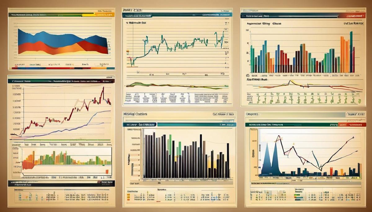
Delving into the world of stock market investing can be a challenging task particularly when trying to understand stock charts. When it comes to investing, stock charts form a crucial aspect in facilitating well-informed decisions, but they can appear intimidating for beginners. This manuscript endeavors to simplify this concept by introducing the different types of stock charts including line charts, bar charts, and candlestick charts each offering a unique presentation of data. The aim is to provide a comprehensive understanding of how to interpret key elements in these charts such as price, volume, timelines and moving averages that play a significant role in the analysis. Additionally, it seeks to impart knowledge on various chart patterns essential in projecting future stock price movements, covering central concepts of trends, channels, and popular patterns like head and shoulders or triple bottoms.
Understanding Different Types of Stock Charts
Aligning Vision with Investment: A Guide to Stock Charts
Dedication, focus, and a careful understanding of the market. This triad forms the backbone of any successful investor’s playbook. But, one secret weapon that many overlook is the ‘stock chart’. A trailblazer in the financial world understands the profound utility of these charts in ticking the boxes of good investment trends and opportunities.
A stock chart, at a glance, may appear a random jumble of lines and colors. Still, upon closer inspection, it reveals critical aspects of a company’s past performance, offering a reliable testimony while predicting future trajectories. However, this is best appreciated in understanding the distinct types of stock charts available.
Line Stock Charts are indisputably the critical, foundational repository of market data. Their simplicity amplifies their appeal; by marking the closing prices over set periods, they sketch out a streamlined overview of stock trends. The purity and ease make them a go-to guide for those embarking on their trading journey.
Bar Stock Charts take the game one notch higher. They represent a more comprehensive spectrum of the market, displaying opening, closing, high and low prices. The integrity of such data gives traders a clearer sense of volatility over time, fostering informed decision-making.
To add nuance to this conversation, the Candlestick Stock Chart is significant. Originating from 18th-century Japanese rice traders, these charts are almost an art form. They exhibit not just the open and close but also the levels reached in a period. The richness of information entailed gives investors a deep understanding of price patterns, further assisting in the prediction of future performance.
For the connoisseurs, the Point and Figure Stock Charts make an interesting study. These charts focus solely on price changes, thereby eliminating time-related fluctuations. This method allows for the separation of significant trends from negligible ‘noise,’ making it perfect for long-term investors focusing on precision.
Last but not least, Volume Stock Charts account for shares traded within a given timeframe. These charts provide a valuable window into the degree of investor interest, thereby affecting future price movements.
Harnessing the power of these stock charts becomes simpler with experience. Reflecting on this collection of tools, it is vivid that they offer differing depths of analysis – from something as simple as end-of-day pricing to intricate patterns hiding in critical price points. Seamlessly integrating these robust systems into trading strategies is where financial titans are born.
Once these charts become an extension of your visionary mind – prepare yourself, you may just be the next Wall Street wizard. Remember, the goal isn’t to predict the future perfectly – it’s about making decisions that capitalize on opportunities and mitigate risks. Therein lies the true essence of successful investing. But for now, keep that chart close, and may the figures be ever in your favor.

Interpreting Key Elements in Stock Charts
Title: Unlocking the Code: Interpreting the Essential Elements in a Stock Chart
After securing commitment and honing your analysis skills to master different stock charts, the logical next step is to uncover how to interpret key elements of these charts and comprehend what they represent. This is a crucial step that illuminates details beyond the raw price and volume information, dishing out an aerial view of the market’s pulse.
The journey begins with appreciating the X and Y axis, providing a space-time matrix for any financial timeline. While the x-axis horizontally shows the time scale, the vertical y-axis quantifies the price level. This framework encapsulates the activity spectrum, revealing market fluctuations that savvy investors watch like hawks.
Next up, the trend line, often referred to as the stock market fortunes’ pulse, warrants thorough understanding. This visual line helps uncover the stock’s direction – upward (an uptrend), downward (downtrend), or sidewards (sideways trend). Recognizing the tendency of stock is key to timing your moves adeptly in the cutthroat ballet of the trading scene.
One cannot afford to overlook support and resistance levels, the two main pillars of stock analysis. The support level represents a price point where a stock’s downturn is halted due to an influx of demand, providing a safety-net for your investments. Conversely, the resistance level marks a price point where selling is believed to be strong enough to prevent the price from rising further. Comprehending these two thresholds allow one to create winning trading strategies, making earnings more predictable.
Price gaps are unexpected declarations of change where the stock price skips a range in a definitive direction and occur due to extraordinary buying or selling pressure. They’re considered to be powerful triggers for trend emergence and their recognition at the right time can be the key to unlocking great profits.
Indicator overlays such as moving averages and oscillators add another layer to existing price and volume data by helping to forecast price changes. These statistical calculations represent the ultimate finesse tools in chart analysis, wringing more profits out of winning trades and reducing losses on the others.
The analysis of stock charts can also extend to sophisticated pattern recognition strategies like the head and shoulders, double tops and bottoms, triangles, and flags. These represent trading behaviors that, over time, shape into recognizable forms on trading charts.
Finally, the ability to integrate other data into your stock chart, such as dividend payments, earnings announcements or other relevant financial news, provides context to stock price movements. Assimilating outside data with core chart analysis can help strategize better and react promptly to market volatility.
In essence, mastering the interpretation of key elements in stock charts isn’t just about being operationally proficient in the mechanics of investing, but also about uniquely tailoring your approach to fit the investing glove perfectly. Ensuring one truly assimilates these components in their investment strategies is the path to dominating the stock market. Dominate and not merely survive – that is the ultimate endgame for any discerning investor.

Learning Basic Chart Patterns
Better understanding stock chart patterns and their predictive power can be a game changer for investors who are looking to make well-informed decisions. delving into the geometry of stock charts can illuminate the trajectory of a stock’s future price movements. This advanced level of market knowledge can provide the investor the edge needed in the ever-competitive world of investing.
The X and Y axis of stock charts serve as the foundation for interpreting complex patterns. The horizontal X axis corresponds to time, while the Y axis is a continuum of price levels. The intersection points denote the changes in a stock’s price over time, and this visual representation can pinpoint game-changing developments in a company’s financials or operations.
Above and beyond the X and Y axis, trend lines shed light on patterns and potential shifts, helping to predict future market behavior. As diagonal lines that connect individual peaks or troughs, trend lines offer insights into the thrust of past stock performance and can signal a price’s upswing or downturn.
Key areas of ‘support’ and ‘resistance’ levels on a stock chart are integral to predicting future price movements. Support levels denote price floors where a stock historically has not fallen below, while resistance levels indicate price ceilings that a stock has struggled to surpass. A breakthrough of these levels usually signifies a change in investor sentiment and potentially a new trend.
Additionally, an overlooked element of stock charts are price gaps, representing significant price jumps with no trading in between. These gaps can impact a stock’s trend and serve as accelerators, providing signals for sharp uptrends or downtrends.
To further enhance price forecasting, indicator overlays like moving averages or oscillators can be used. These statistical tools reveal hidden trends and can help forecast future price movements by analyzing past market fluctuations.
Pattern recognition is another crucial strategy. Certain chart patterns such as head and shoulders, double tops and bottoms, triangles, and flags, have been shown to predict future price actions with great accuracy. The key is recognizing these patterns as they form and executing trades at the right time.
Finally, one should integrate other vital data into these stock charts. Dividend payments, earnings announcements, and other financial news can influence stocks significantly. A shift in these external factors can reshape the price pattern, leading to a new trend or reversal.
So, there you have it – a comprehensive guide to understanding and utilizing stock chart patterns, along with the imperative strategies to predict future price movements. Harness this knowledge to navigate through the rough terrains of the market and drive your portfolio to new heights. Remember, the stock market isn’t a game of chance, it’s a game of skill, patience, and knowledge. And at the end of the day, knowledge equals power.

Photo by aridley88 on Unsplash
After exploring the concept of stock charts, it becomes clear that they are invaluable tools for any investor. They provide an intriguing rhythm of the market, making sense of the several moving parts in the world of stocks. In mastering the art of reading stock charts, you will be well-equipped to interpret line, bar, and candlestick charts, comprehend crucial elements like price, volume and timelines, as well as the relevance of moving averages. Moreover, you’ll be able to recognize various chart patterns that could indicate future price trends. By taking to heart the insights gained, you are paving the way towards making well-informed, judicious investment decisions, ensuring your journey into the stock market is a rewarding adventure.
